How to Coordinate Mommy & Me Outfits Without Matching
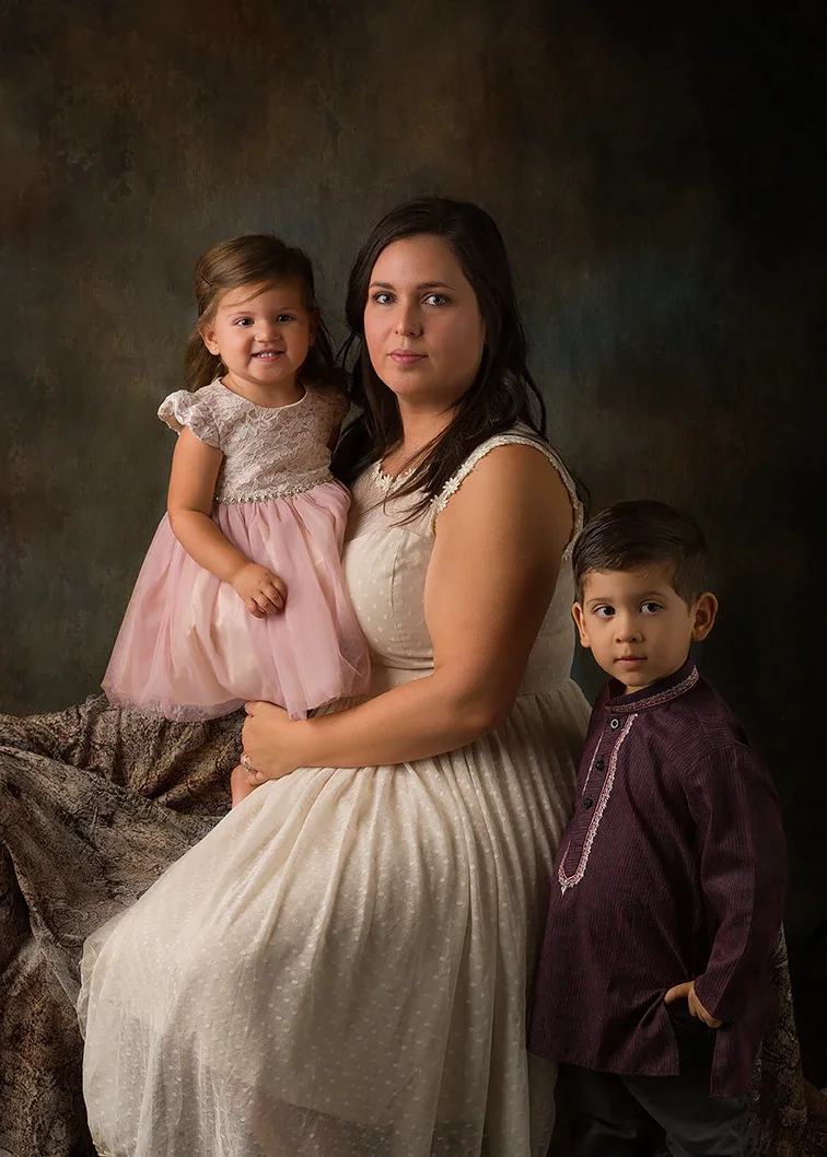
Coordinating outfits does not mean everyone needs to match. Here, Mom’s soft ivory dress creates the foundation, while her daughter’s blush pink and her son’s deep burgundy add complementary color and visual interest. The different colors work together while allowing each person to remain distinct, keeping the attention on the family rather than the clothing.
One of the most common questions when planning Mommy & Me photos is what everyone should wear.
The goal is not to make Mom and her children look identical.
In fact, matching too closely can make a portrait feel more like a coordinated uniform than a thoughtfully styled photograph.
For Mommy & Me photos, I prefer coordination rather than matching.
That means choosing colors, textures, and clothing styles that look intentional together while allowing each person to wear something that suits them individually.
Here is how to coordinate Mommy & Me outfits without everyone wearing the same thing.
Start With Mom
Choose Mom’s outfit first.
This is one of the most important wardrobe decisions for a Mommy & Me session because Mom appears in most of the photographs and usually occupies a significant portion of the composition.
Instead of finding adorable outfits for the children and then trying to figure out what Mom can wear with them, reverse the process.
Choose something for Mom that:
Fits well
Photographs beautifully
Works with the portrait style
Feels appropriate for the level of formality
Gives you a color direction for the rest of the family
Once Mom’s outfit is selected, coordinating the children becomes much easier. For a broader look at dresses, fabrics, textures, shoes, accessories, and wardrobe planning, see my What to Wear for Mommy & Me Photos guide.
Choose a Color Palette, Not One Color
Instead of choosing one color for everyone, choose a small palette of approximately two to four colors.
For example:
Palette 1
Cream
Dusty rose
Taupe
Soft brown
Palette 2
Navy
Muted blue
Gray
Ivory
Palette 3
Burgundy
Blush
Camel
Cream
Palette 4
Olive
Warm beige
Ivory
Chocolate brown
Everyone can then wear a different part of the palette.
The colors relate to one another without being identical.
Mom Does Not Have to Match Her Daughter
Matching mother-and-daughter dresses can be fun, but they are not necessary for beautiful Mommy & Me portraits.
Consider using related colors instead.
If Mom wears dusty rose, her daughter might wear cream.
If Mom wears navy, her daughter might wear muted blue.
If Mom wears burgundy, her daughter might wear blush or ivory.
The clothing still looks intentional, but each person remains visually distinct.
This is especially useful in studio portraits because subtle differences in color help separate the subjects from one another.
Coordinating Mom and a Son
Mom and her son certainly do not need to wear the same color.
Suppose Mom chooses a deep green dress.
Her son could wear:
Cream shirt with camel trousers
Soft gray with dark trousers
Beige with brown
Ivory with muted green accents
The connection comes from the overall palette rather than one matching color.
The same principle works whether your son is a baby, toddler, or older child. For babies, wardrobe is only one consideration. Mommy & Me Photos With a Baby: What to Expect covers clothing, feeding, naps, developmental stages, posing, and preparing for the session.
Use Different Shades of the Same Color Family
Another easy approach is to use different shades from the same color family.
For example:
Mom might wear deep plum while her daughter wears dusty lavender.
Mom might wear navy while her child wears a softer blue.
Mom might wear chocolate brown while her child wears warm beige.
Because the colors share similar undertones, they naturally work together without looking identical.
This can create a particularly sophisticated result for painterly studio portraits.
Neutrals Can Hold the Palette Together
Neutrals are useful because they connect stronger colors without competing with them.
Cream, ivory, taupe, camel, gray, beige, and soft brown can act as bridges between other colors.
For example:
Mom: burgundy dress
Daughter: cream dress
Son: camel trousers with an ivory shirt
The burgundy gives the portrait depth while the neutrals keep the children's clothing connected to Mom without copying her color.
Texture Creates Coordination Without More Color
Color is not the only way to coordinate clothing.
Texture can create visual relationships too.
Consider:
Lace
Linen
Velvet
Tulle
Chiffon
Knits
Subtle embroidery
Soft woven fabrics
For example, Mom might wear a solid velvet dress while her daughter wears a cream lace dress.
The colors are different, but the richness of the fabrics makes both outfits feel appropriate for the same portrait.
Texture is particularly useful when working with a mostly neutral palette.
One Pattern Is Usually Enough
Patterns can work in Mommy & Me portraits, but several competing patterns can quickly make the photograph visually busy.
If someone is wearing a pattern, consider making that the starting point for the rest of the wardrobe.
Suppose a daughter's dress contains muted blue, cream, and dusty rose.
Mom might wear dusty rose.
A second child might wear cream and muted blue.
Instead of adding another pattern, pull colors from the original patterned garment.
That creates coordination without visual competition.
Consider the Level of Formality
Color coordination alone is not enough.
The clothing should also feel as though everyone is attending the same event.
If Mom is wearing an elegant floor-length gown and her child is wearing a graphic T-shirt and sneakers, the problem is not necessarily color.
It is formality.
Likewise, if Mom wants a relaxed contemporary portrait, an extremely formal child's outfit may feel disconnected.
Think about both:
Do these colors belong together?
and
Do these clothing styles belong together?
Both matter.
Coordinate With the Background Too
Your outfits also need to work with the environment in which they will be photographed.
For studio Mommy & Me portraits, I consider wardrobe, backdrop, and lighting as parts of the same composition.
Rich jewel tones can work beautifully with darker painterly backgrounds.
Creams and soft neutrals can create a lighter, quieter portrait.
Muted colors often work well because they add color without overwhelming faces.
This is another reason I prefer discussing wardrobe before the session.
We are not simply choosing attractive clothes.
We are planning the finished photograph.
Wardrobe is only one part of planning the finished portrait. My Complete Guide to Mommy & Me Photography in Los Angeles covers ages, posing, babies, toddlers, session preparation, and what to expect.
Coordinating More Than One Child
Once several children are involved, resist the temptation to put them all in matching outfits.
Instead, distribute the palette.
For example:
Mom: deep plum
Child 1: cream
Child 2: muted mauve
Child 3: camel and ivory
Now imagine those colors together rather than evaluating each outfit separately.
They create one visual composition without making the children look as though they are wearing a uniform.
What About Siblings Wearing the Same Outfit?
There is nothing inherently wrong with matching sibling outfits, particularly with very young children.
But if your goal is a more timeless or painterly portrait, coordinating often creates more depth.
Two daughters might wear different dresses in related colors.
Two sons might wear similar trousers but different shirts.
The clothing can clearly belong together without being duplicated.
Should Everyone Wear Neutrals?
No.
Neutral palettes are popular because they are easy to coordinate and tend to keep attention on faces.
But that does not mean every Mommy & Me session should be beige and cream.
Color can be beautiful.
Burgundy, navy, dusty rose, muted green, plum, rust, soft blue, and other controlled colors can give a portrait depth and personality.
The issue is not whether you use color.
The issue is whether the colors work together.
Avoid Introducing Too Many Colors
A limited palette usually creates a stronger photograph.
If every person introduces an unrelated color, the eye starts jumping around the image.
You generally do not need six different colors simply because six people are being photographed.
Repeat colors subtly.
One child's trousers might relate to Mom's dress.
Another child's shirt might relate to a sibling's dress.
Small repetitions create visual connections across the portrait.
Pay Attention to Undertones
Two colors can technically have the same name and still clash.
There are warm creams and cool creams.
Warm grays and cool grays.
Blue-based reds and orange-based reds.
When you place the outfits together, look at them in the same light.
If one outfit has very warm undertones and another is extremely cool, they may not coordinate as well as you expected.
You do not need to become a color theorist.
Simply put everything together before the session and look at the collection as a whole.
Lay Everything Out Before the Session
One of the easiest ways to evaluate your wardrobe is to place all the clothing together.
Put Mom's outfit in the center.
Arrange the children's outfits around it.
Then look at the entire group.
Ask:
Does one piece immediately dominate?
Is there too much pattern?
Does one color seem unrelated to everything else?
Is everyone dressed at approximately the same level of formality?
Do the colors feel intentional together?
Is there enough variation that everyone remains visually distinct?
Problems are much easier to see when all the clothing is viewed together.
Plan Each Outfit Change Separately
If your Mommy & Me session includes two wardrobe looks, you do not need to make the first wardrobe coordinate with the second.
Treat them as two separate portrait collections.
For example:
Look One: Painterly
Mom might wear a deep burgundy gown while the children wear cream, camel, and muted rose.
Look Two: Contemporary
Mom might change into ivory while the children wear soft blue, gray, and cream.
Each look has its own palette.
The connection between the two collections comes from the people in the photographs, not from repeating the same wardrobe colors.
Avoid Buying Everything From One Matching Collection
Retailers often make it easy to purchase coordinating family clothing from one seasonal collection.
That can be convenient, but it can also create an overly matched appearance.
You do not need every item to come from the same store or collection.
In many cases, combining individual pieces creates a more personal and sophisticated wardrobe.
The common thread can simply be color, texture, and formality.
The Goal Is Visual Connection
When wardrobe coordination works well, you should notice the people before you notice their clothing.
The outfits create structure around the portrait without becoming the subject.
That is the difference between matching and coordinating.
Matching asks:
How can everyone wear the same thing?
Coordinating asks:
How can everyone look like they belong in the same photograph?
For Mommy & Me portraits, the second question is usually much more useful.
Continue Learning
Best Ages for Mommy & Me Photos
Learn how mother-and-child portraits change from the newborn stage through babies, toddlers, older children, teens, and adult children.
What Happens During a Mommy & Me Photo Session?
See how a studio Mommy & Me session works, including posing, wardrobe changes, working with children, and creating different portrait styles.
What If My Child Won’t Cooperate for Mommy & Me Photos?
Learn how Mommy & Me sessions adapt to toddlers, shy children, short attention spans, movement, and unexpected changes during the session.
See Mommy & Me Photography in Los Angeles for information about my studio portrait style, painterly and contemporary options, and planning a mother-and-child session.